Back from Down Under

Feb 18 2013

Had a great and productive trip to Australia. First went to Melbourne to see our new friends at Dumbo Feather. Gotta get these issues in the U.S. Then it was off to Sydney to see old friends, new friends, and new clients. Along the way I was sure to take plenty of snapshots. And, I’ve been wanting to try out this new app called Haiku Deck for a while and finally had the chance to put a simple presentation to walk through the scenes from Down Under.


Tags

Launch: RD2 crafts a new responsive website design for The Funding Network, Australia.

Feb 18 2013

RD2 just crafted and launched a new responsive website design for Australian addition to The Funding Network. The Funding Network is a UK based non-profit that takes a unique approach to raising funds for other non-profits…LIVE crowd funding. Having had great success in the UK, the Australian branch is one of several offshoots meant to expand their ecosystem of giving.

With initial setup and funding still in it’s infancy, the Australian arm contacted RD2 to help quickly establish their online presence in a way that was in-line with their published promotional materials, and that would help build buzz about new projects. Designed, built, and tested in just under 5 days, the new website design is both responsive and informative.

In order to more quickly help people identify that this is an Australian-based branch, we opted to use some of the great photography associated with Australia and tie it to each event. Once the event has passed, the Home page of the website will cycle to the next event, highlighting a new place and a new set of charitable projects. Additionally, sign-up forms are on every page to make sure that users never have to flick or scroll far to become part of the movement. Per usual, we recommended this site be a home base for The Funding Network/Australia as they launch their social media information streams and incorporated a blog. Even though the timeline was short, we always insist on making sure our partners are positioned for future growth, which is something we we really hope we see with TFN Australia.

Platform? WordPress, of course.

Be sure to visit the website (on all your devices) and let us know what you think.

The Funding Network, Australia

RD2 crafts a new responsive website design for The Funding Network, Australia | Home Page

RD2 crafts a new responsive website design for The Funding Network, Australia | TFN In Action Page

Tips & Tricks: Creating better textures using CSS3 gradients

Jan 30 2013

Graphic Information is Everywhere

There are two fundamental elements that make up our world and how we understand the information in it: Texture and Color Gradients. These two elements play a vital role in telling us all sorts of information like whether an orange is ripe or whether a button on a website is clickable. In the world of the Web, texture is commonly known as “noise”. Despite it’s prevalent use around the Web, producing noise has always been cumbersome, clunky, graphic intensive.

Creating Noise

Noise is often used to help users distinguish important information from less important information. It is also used to give a website a unique feel or effect. It is almost always rendered in Photoshop and as a direct part of the layer, color, or color gradient on which it is applied. When Photoshop creates it’s Noise Effect, it renders millions of points of varying light and dark pixels directly within the layer on which it’s being applied. This creates a lot of subtle color shifts that are specific to that individual layer, color, or color gradient. Transitioning elements with noise to a website has traditionally meant many large, problematic images and usually a CSS hack or two.

Suddenly, with CSS3 gradients, half of the work was suddenly done! With about 15 minutes to spare, we thought we would try and tackle the other half of the issue…creating a transparent PNG that would create a noise pattern on a variety of colors.

Abracadabra

We knew before starting that as a PNG, we would be strictly limited to Web safe colors and opacity options to create something that normally Photoshop creates unique to each instance.  So we started by creating  a small 250×250 pixel canvas with a transparent background, and then set to work. We then created a new layer, filled it with white, and then added monochromatic Noise in the range of 7-10%. We almost always opt for the Gaussian distribution. Now for the good part…Grab your Magic and do magic.

And Presto! We were able to produce the sweet examples below…

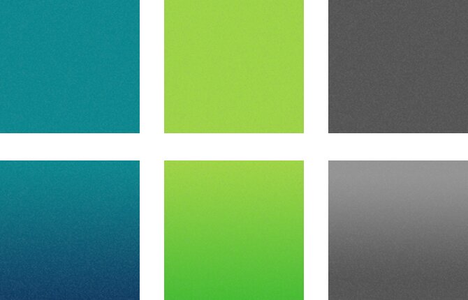
The noise pattern we’ve created here is subtle and perhaps a little large. Although not perfect, we were excited about the initial results. The greatest benefit is that we are able to load 1 small file for every texture on the site.

The Goodies

So of course, we can’t give away ALL our secrets, but what good is having friends if we can’t share the Love? While the results aren’t perfect, we are happy to have had a successful adventure. Below is the code and resources links to get you started building better textures and a better Web.

Download Noise Background

Solid Background with Noise

background: #575757 url('/images/bg-noise.png') left top repeat;

Gradient Background with Noise

background: #939393 url('/images/bg-noise.png') left top repeat; /* ie fallback */
background: url('/images/bg-noise.png') left top repeat,
            -webkit-gradient(linear, 0 0, 0 bottom, from(#939393), to(#535353));
background: url('/images/bg-noise.png') left top repeat,
            -webkit-linear-gradient(#939393, #535353);
background: url('/images/bg-noise.png') left top repeat,
            -moz-linear-gradient(#939393, #535353);
background: url('/images/bg-noise.png') left top repeat,
            -ms-linear-gradient(#939393, #535353);
background: url('/images/bg-noise.png') left top repeat,
            -o-linear-gradient(#939393, #535353);
background: url('/images/bg-noise.png') left top repeat,
            linear-gradient(#939393, #535353);

View Example

One Color Gradient Background with Noise

In a recent project here at RD2, we built a front-end template for a client. The trick was to create this very complex design using gradients, but to easily change all the colors by simply switching out a single hex value. This is where the beauty RGBA color values and CSS3 multiple backgrounds come in. See the example below:

background: #939393 url('/images/bg-noise.png') left top repeat; /* ie fallback */
background: url('/images/bg-noise.png') left top repeat,
            -webkit-gradient(linear, 0 0, 0 bottom, from(rgba(255, 255, 255, 0.1)), to(rgba(0, 0, 0, 0.5))),
            #939393;
background: url('/images/bg-noise.png') left top repeat,
            -webkit-linear-gradient(rgba(255, 255, 255, 0.1), rgba(0, 0, 0, 0.5)),
            #939393;
background: url('/images/bg-noise.png') left top repeat,
            -moz-linear-gradient(rgba(255, 255, 255, 0.1), rgba(0, 0, 0, 0.5)),
            #939393;
background: url('/images/bg-noise.png') left top repeat,
            -ms-linear-gradient(rgba(255, 255, 255, 0.1), rgba(0, 0, 0, 0.5)),
            #939393;
background: url('/images/bg-noise.png') left top repeat,
            -o-linear-gradientrgba(255, 255, 255, 0.1), rgba(0, 0, 0, 0.5)),
            #939393;
background: url('/images/bg-noise.png') left top repeat,
            linear-gradient(rgba(255, 255, 255, 0.1), rgba(0, 0, 0, 0.5)),
            #939393;

View Example

UPDATE: As happens on the Web, you sometimes find great links and resources after you’ve already done it yourself. As we were pushing “publish” on this post, we found a great tool by Andrew Ckor that we had to pass along: http://www.noisetexturegenerator.com/. It rocks.

Responsive Website VS Mobile Application

Jan 22 2013

As more and more consumers make smartphone purchases, the arguments around the “New Web” escalate. The most heated being the debate about mobile apps VS responsive design. Which is best?

Native mobile app pundits all heard Mark Zuckerberg loud and clear when he made his famous statement about going to a native mobile app vs HTML5. There’s a very strong case for native mobile apps for companies like Facebook, or Evernote, or Path, or Tweetbot that boast complex interactions and functionality. The Zuck also has deep pockets and dedicated teams to push a complex application (with very specific Use Cases that leverage device hardware) in the native direction. The RD2 point-of-view is to always look to your Use Cases and let them define your native vs non-native needs.

But let’s do some comparison. The following chart illustrates a few points that are worth considering when thinking about creating a responsive website VS a mobile app.

Chart: Responsive Web VS Mobile Applications

Marketing Integration
Currently, there is a big gap in the ability of mobile apps to function with and track results of any online-based marketing campaign. For instance, an email campaign in conjunction with a mobile app only shows you half the story…who opened and clicked the email. With a responsive website, you can see both sides. Who clicked the email (be it from their computer or their smartphone) and what they did on your website. As an added bonus, the responsive website can tie directly into the look and feel of the marketing campaign. Native mobile apps have hobbled this simple experience which creates another degree of separation away from the analytics marketers need.

Content Management
Today’s websites, when built on the right platform, can act as a solid backbone for both a responsive website and a mobile app. But while a website can be quickly and easily updated to add new content and enhancements, updating a mobile app can be laborious and expensive.

Content Accessibility
When creating an iOS mobile app, you are only talking to one audience: those with an Apple product. When you create a responsive website, your online conversation can happen with anyone who has 
a device that will access the Internet. Furthermore, your website will be smart enough to bring your content to those devices in a way that provides the best possible representation and design, rather than a website that looks like a desktop monitor squashed into an iPhone screen.

Internet Access
While a mobile app might allow you to store some content locally, the bulk of mobile apps require just as much, if not more, access to the internet to support content updates, location searches, and more. The key difference is the consumer expectation…Consumers expect mobile apps to work no matter their access to the Web. If a mobile app does not function (either all or in part) without Internet, then the mobile app will have failed in the mind of the consumer.

Risk of Mobile App Rejection
A commonly overlooked point is that ALL mobile apps must be submitted to a third party system for approval before being released to the public. Subject to changing guidelines, unknown corporate agendas, weekends, and holidays, such approval times may vary from a few days to several months. Not to mention the costs to fix any issues that might arise through the application process as it will likely need to be applied to the iOS, Android, and Windows Mobile ecosystems.

Development Costs
With the contenders in the smartphone industry constantly growing and changing, developing mobile apps specific to each device and each platform can be expensive. Additionally, creating a mobile app means supporting multiple versions of software since no smartphone producer has a way of forcing everyone to be running the same operating system. Conversely, a responsive website is only limited by the capabilities of the Internet browser…something that is well documented, easily managed, and progressing everyday.

Access to Device Hardware
While there are many ways in which responsive websites might seem a better solution, the key attribute that makes mobile apps great is their ability to access the functions and capabilities of the device. While there are sometimes a few tricks to allow websites to gain access to things like GPS positioning, they are never universal and unreliable at best. A mobile app clearly excels when it comes to creating unique interaction experiences like taking a picture and posting it to Facebook or scanning a QR code to entry a drawing for a prize giveaway.

The Pudding
RD2 has been involved in both sides of the mobile app and responsive Web debate. Check out some of the apps we’ve done for Dell, Management Exchange, and Tyler Technologies as well as some of our more recent responsive website efforts.

Bottom Line

The current state of the mobile application and mobile Web space is a huge challenge for brands today. It’s the hand grenade in the room minus the pin for marketing teams and brand managers who want to create memorable and useful applications for consumers. Building integrated mobile applications that target Apple, Android, and Windows is a high cost game where the rules change frequently.

Brands do have alternatives to play in this space. The emerging HTML5 is growing stronger nearly every day and there are many Use Cases that support the responsive methods of Web design. Mobile platforms cannot deny their consumers access to the Web browser, the line of demarcation for mobile Web expectations. This approach affords brands a safe zone where they can be creative with their brand content as well as a ubiquitous mobile experience.

While we at RD2 love mobile apps, and have built many, we recommend first defining business objectives and benefits expected from a mobile experience. Break that experience down into clear Use Cases. Then determine if those Use Cases point to features and functions that require access to device hardware or other “mobile app only” supported instances. Then, define the value of your features and functions against your business case and the value to your target audience. Make your decision based on the aggregate of your findings. Does building a mobile Web app jive with my business model AND provide a user experience that cannot be supported using responsive Web design approaches? Then you will have your answer.


What do you think about the the capabilities of a responsive site VS a mobile application? Let us know in the comments below or on Twitter or Facebook.


Giving Bugzilla a monster makeover.

Jan 3 2013

We use Bugzilla a lot here at RD2. It is a great tool for tracking website and app issues, assigning tasks, and all round helping us get projects from Development to Launch. Unfortunately, especially for those of us that are more design oriented, it’s lack of aesthetics is almost unbearable. When I realized that I would be working with it on a daily basis, I had to find a way to make this tool palatable.

Bugzilla had to get a makeover.

more…

Nine

Dec 19 2012

Three thousand, two hundred, eighty five days. That’s how long RD2 has been in business. The last single digit before our ten year anniversary. Following are a few reasons as to why this day is significant to myself and the team…

I started with a partner (Larry Dupler). Bought him out. And today he’s still one of my closest friends. How many partners can see both sides of a recession, go separate ways, and both look back at the experience as a positive one?

We started the world’s first airline blog, and it went on to be recognized as the world’s best corporate blog, four years consecutively.

We stood by many small businesses and helped them develop their brands. We’ve seen many become incredibly successful. Those same businesses stood by us when we needed them.

We started our own blog. And while we’re not blogging every day, we’re still blogging. Even if we are the only ones who care. After all, YOU or WE are among the most important audience.

We’ve sponsored many cycling teams, even if I’m the only one who really cares about cycling. But the team at RD2 is kind enough to humor me anyway. Some of the teams we have been involved with are among the best in the world (Elbowz and Pure Black Racing).

Our interest in cycling graduated to the world of professional motorcycle racing. We branded a MotoGP racer with a new identity and website. We even designed the helmet and signage for the bike.

We pioneered the use of today’s most popular web publishing system, WordPress, as a viable solution for building corporate websites, long before it was recognized as anything but a blogging tool.

We’ve done amazing things with Microsoft Sharepoint, building banking and high tech websites that are stunning to look at and incredibly functional. Recognized by senior leadership and technology evangelists as “best looking Sharepoint website I’ve seen.”

We’ve been printed in Communication Arts for our work in corporate branding. And have developed countless identity systems.

We’ve traveled south of the equator, to New Zealand, three times to build websites for the worlds greatest sailing team, Team New Zealand. While visiting, we also developed the identity system and website for PowerbyProxi who recently visited with the Prince of Wales. Also, when down under, we designed and developed the website for the tremendously successful Pure Black Racing team, as well as for a world class high-availability software provider, MaxAva.

We partnered with Tyler Technologies to create desktop applications for courtrooms and iPad apps for police cars. And the partnership continues into 2013.

We designed and built a website for some of the world’s greatest thinkers, The Management Exchange. Working closely with Gary Hamel and his team inspired great things not only in us, but in the website that has become so important to business innovation.

This year, we made some great new friends in Canada as we designed the Ford Canada blog. We stepped up our game to build standards and contribute to the world of responsive web design. We were introduced to a terrific agency named Sonic Boom who have been the best partners imaginable through our Ford relationship.

The list goes on and on. Hundreds and hundreds of projects. Countless late nights. Hundreds of plane flights. And a few temper tantrums for good measure.

But the most important things are saved for last, but not least. While working at RD2, some purchased their first homes, gave birth to their first, second, or third children, some were married, and some are planning a wedding. We do our work with passion, and we’re still hungry to make ourselves better. We’ve made a difference in our field, and in the homes of our team. We’ve seen recessions overstay their welcome, and have persevered through difficult times.

But we’re here. Nine years later. Still in one piece. And better than ever. Happy Ninth Birthday, RD2!

Tags

Nine Years. Where has all the time gone?

Dec 19 2012
Nine Years. Where has all the time gone?

Nine years ago on December 19, 2003, RD2 sprang to life within the confines of Chris Ronan’s own garage. You might say it was a humble beginning, but sometimes the best and most impactful results stem from something many may deem small. Plus, it had White Rock Lake as the backdrop so I mean, c’mon, it wasn’t that bad.

Our First Home

Our Current Home

Over the years, RD2 grew in client base and employees. There were growing pains, and lessons to be learned. Throughout all this, the singular vision of RD2 was never lost and remained steadfast. Simply Innovate Brands. An easy to remember and understand concept, yet so many other companies have tried the same and faltered. By remaining nimble and always looking to what is next, RD2 has been able to overcome the hardships of opening its doors during a recession, being hit once again with an economic downturn in 2008 and now faced with the uncertainty of the future (like in two days when the world comes to an end if you are following your handy-dandy Mayan Calendar*).

For people who have been at RD2 for a while, to those you are relatively new to our family, we take a moment to think and reflect about what a great place RD2 is to work at everyday. Then we get right back to researching, designing, and developing.

*If you are reading this on December 22, we totally did not believe for a second that Mayan prediction stuff. Hahaha, that would have been just silly.

Tags

Emirates Team New Zealand Hoists the Main Sail

Oct 30 2012

Lots of companies have a blog. Lots of companies think they have a lot to say. Once they have one in place it isn’t always utilized effectively or the content is not as meaningful as it needs to be. So, it is great when a company really embraces their inner writer and publishes posts daily, if not multiple times a day with rich and meaningful content. Such is the case with Emirates Team New Zealand and their blog.

A Solid Home Base

With the America’s Cup World Series recently wrapping up and the ETNZ Team taking fourth overall, there was reason for celebration, fanfare, and spreading the news. So much so that we had to revisit how we were treating the homepage of the blog. Prior to the update we simply had the latest blog post at the top of the page. ETNZ is not only a world-class sailing team, they are also some of the most prolific writers we have come across in a long time, often posting multiple stories within a 24 hour period. To better serve the rush of posts coming in, we are now displaying the four latest blog posts along with an expandable video carousel showcases the ten latest videos.

WPtouch and Go

With this update we also installed the latest WPtouch plugin to the blog in order to optimize the content through all mobile devices like iPhone and Android to name a few. This will allow users to get a mobile view of all the content while they are on the go. Before the update, users would have to pinch and zoom in order to fully digest a majority of the content within the website.

Visit the ETNZ Blog